
Apple isn't the only one raising the ceiling on what a wallet pass can be this year. Google Wallet is rolling out its biggest visual overhaul in years, and it lands in two parts: a redesigned app that changes how customers find your pass, and a redesigned pass page that changes what they see when they open it. Neither requires you to reissue anything, but both reward issuers who prepared and quietly punish those who didn't.
The new home screen: a grid, stars, and a hub
The app-level redesign is already live on Android. Passes now sit in a compact two-column grid, customers can star the passes they use most to pin them near the top, and everything else lives behind a searchable "view more" hub.
This sounds cosmetic. It isn't. In the old list, every pass got a wide card and a fighting chance of being seen. In the grid, your pass is a small tile among many, and the passes a customer stars are the ones that stay visible. Getting starred is the new front of wallet, and passes earn it the same way they earn anything: by being useful often enough that the customer wants them within reach. A pass that updates with a points balance, a live offer, or a relevant notification gives someone a reason to keep it close. A static pass sinks into the hub.
This is where the lifecycle argument stops being abstract. "Keep the pass live" used to be advice about trust; the grid turns it into placement. Every balance update, every timely offer, every lock-screen message is now also a reason for the customer to star your pass, and starring is what keeps you on the first screen of their wallet. Programs wired into their CRM, where the pass moves whenever the relationship does, earn that position as a side effect of just working.
There's a smaller, more practical consequence too: at grid size, your pass is mostly a logo and a background color. If those two don't identify you at a glance, the tile reads as noise, which is the same discipline behind designing a pass people keep.
The new pass page: edge to edge, and more visible by default
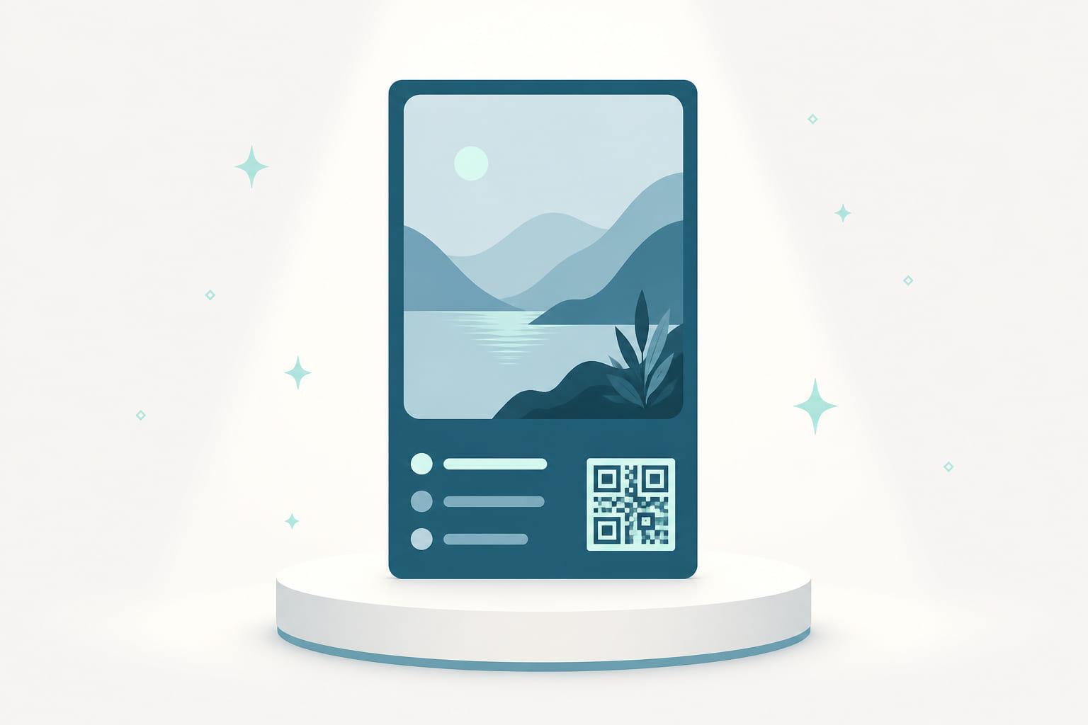
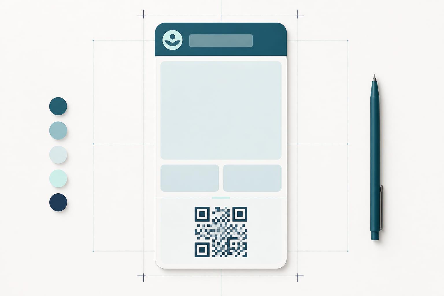
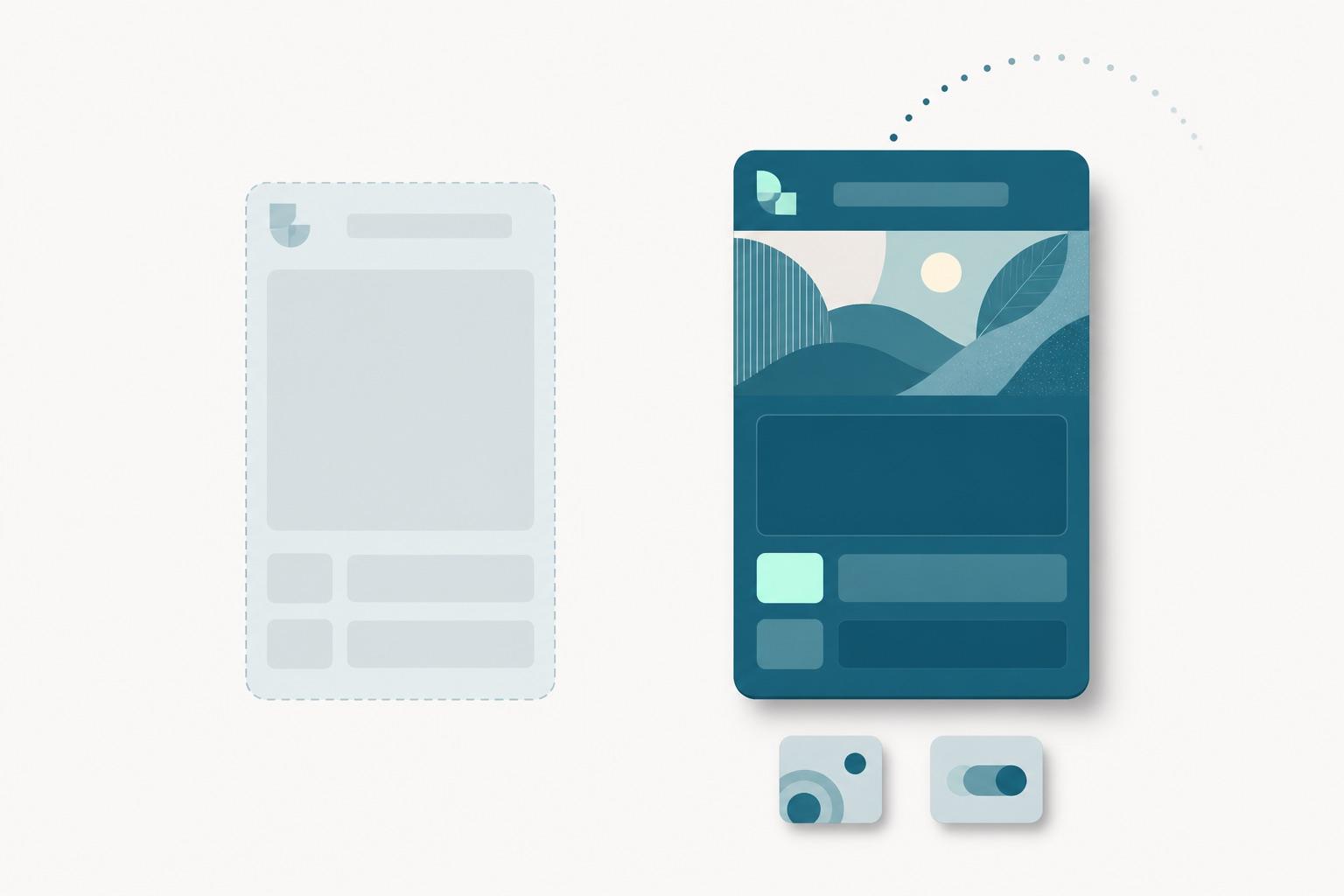
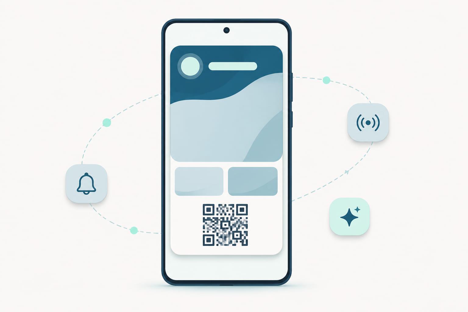
The bigger change is still in partner preview: the redesigned pass page itself. When it arrives, an opened pass gets an edge-to-edge background color, a larger hero image at the top, and information grouped into visual components instead of stacked rows. Details that used to hide behind a three-dot menu, like program information and settings, move onto the page or into a dedicated settings view. Links to your website, locations, and support are expected to become more prominent.
The direction rhymes with what Apple did with poster layouts: the pass stops looking like a database record with a logo and starts looking like a piece of the brand. Color does more work, imagery does more work, and more of the pass content is visible without digging.
The flip side of "more visible" is that whatever is currently on your pass gets seen. Long program names that truncated politely in the old layout, placeholder field values nobody expected customers to read, a support link that points somewhere stale: the redesign promotes all of it to the first screen.
What issuers should check now
Existing passes are backwards compatible, and updates you make to a pass class propagate to passes already saved. That means the preparation is a review, not a migration:
- Hero imagery. Google's guidance now points to a full-width image at roughly 5:4 (1032 × 812px), high resolution, with breathing room and no text baked into the image. Older, narrower banners may crop unpredictably.
- Logo and color contrast. The background color now dominates the entire page, and the grid renders your pass small. Check that the logo holds up against the background at both sizes.
- Field values and program names. Read them as a customer will, on the first screen, ungated by a menu. Trim what's long, fix what's placeholder.
- Links. Website, support, and location links are moving up in the hierarchy. Verify each one still points where it should.
None of this is engineering work, which is rather the point. The wallet platforms keep improving the frame around your pass; your job is to make sure what's inside the frame deserves it.
The mechanics of shipping the review are where your platform earns its keep. Because class updates propagate to passes already in wallets, fixing a cropped banner or a stale link is an edit, not a reissue: change it once in the portal and every saved pass follows. On Stell that review is one afternoon with a designer, not a ticket queue, and the same assets are checked against how the pass renders on the Apple side at the same time, because a program that looks sharp in one wallet and dated in the other has only done half the work.
The short version
- Google Wallet's home screen is now a compact grid with starred favorites, so frequently useful passes stay visible and static ones drift into a hub.
- The redesigned pass page, still in partner preview, brings edge-to-edge color, larger hero imagery, and more information on the first screen.
- Nothing needs reissuing: passes are backwards compatible and class updates propagate automatically, but imagery, contrast, field text, and links deserve a review before the rollout reaches your customers.
Together with what iOS 27 brings to Apple Wallet, 2026 is the year both wallets decided passes should look like the brands that issue them. The programs that treat the pass as a living surface, updated often and worth starring, are the ones the redesign rewards. Keeping that surface live, on both platforms, from one place: that is what Stell is for. See the platform.