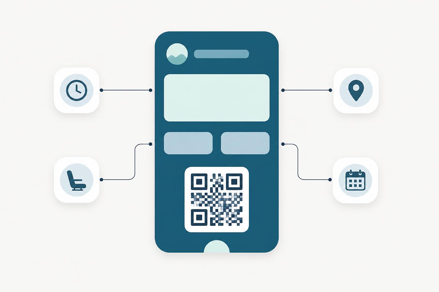


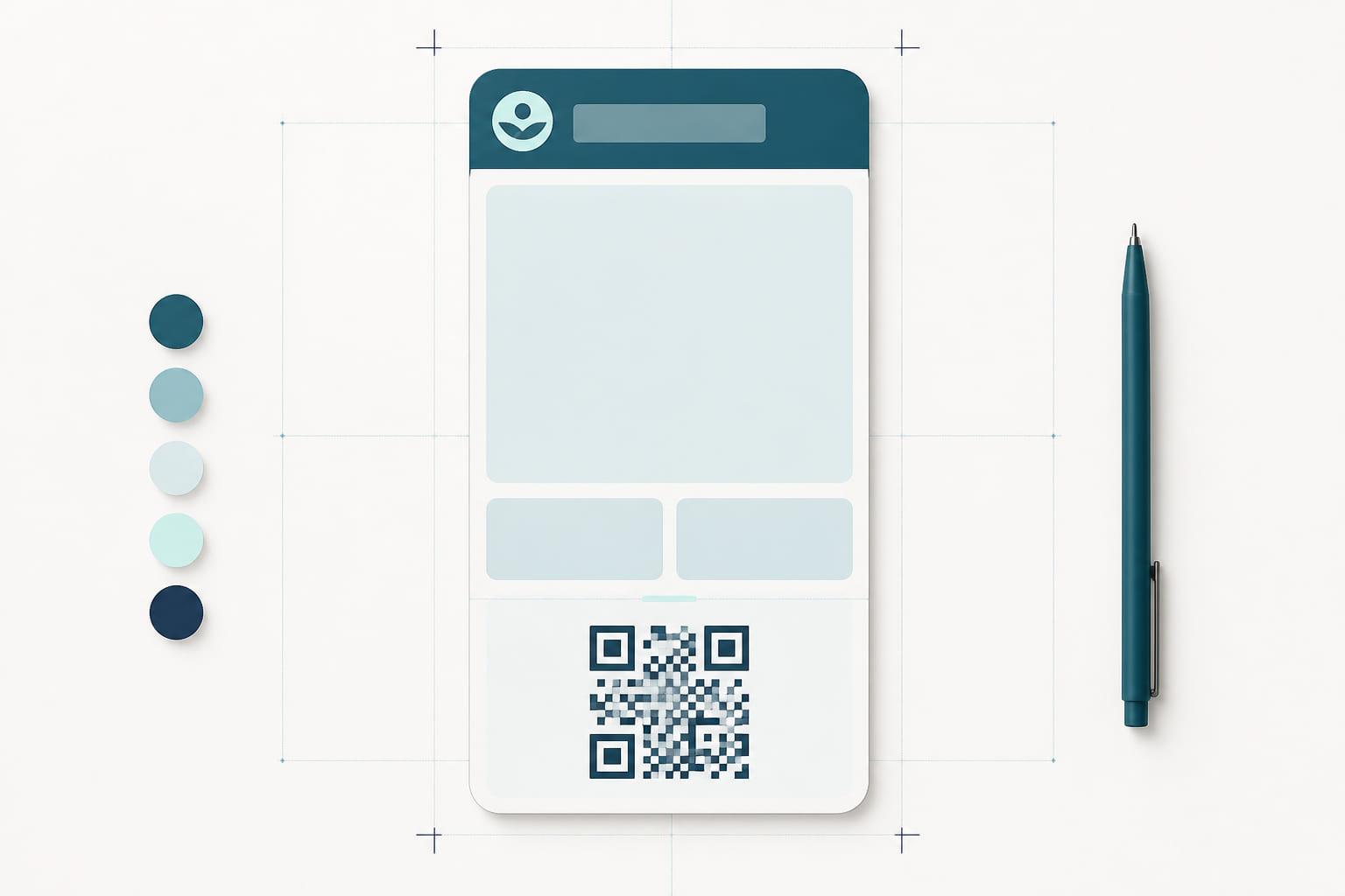
A wallet pass is one of the smallest design surfaces a brand will ever ship, and one of the most permanent. It sits alongside boarding passes and payment cards, gets glanced at for two seconds at a till, and either looks like it belongs there or it does not. Passes that look wrong get deleted; passes that look right get kept for years.
The constraint is the gift. A pass offers a header row, a primary field, a handful of secondary fields, a barcode or NFC area, and a back. That is the whole canvas. Good pass design is almost entirely the discipline of deciding what deserves those few slots.
Start with the glance
A pass is read in one situation above all others: held up at a counter, for about two seconds, by someone mid-transaction. Design for that glance and everything else follows.
- The primary field carries the one number that matters. For a loyalty pass that is usually the points or stamp balance; for a membership, the tier or status. One value, large, current. If you are debating between two candidates, one of them belongs in a secondary field.
- The header row is identity, not decoration. Your logo mark and program name, small and confident. The customer already knows whose pass it is; the header confirms it for the person behind the counter.
- Secondary fields answer the follow-up question. Member since, tier, next reward, expiry. Two or three at most. Four fields fighting for the same row all lose.
- The code area is functional, not shameful. Whether the pass identifies by QR, barcode, or NFC tap, that is the pass doing its job. Give a scannable code space and contrast; a code squeezed to fit decoration fails at the till, which is the one place failure is public.
Color, type, and restraint
Wallets render passes on your colors, and the rules are unforgiving in the way small surfaces are.
- Pick a background that is yours and test text on it. The wallet renders your field labels and values over your color. Insufficient contrast does not look edgy; it looks broken, in both light and dark surroundings.
- Resist the poster instinct. The pass face is not an ad slot. Brands that treat it as one, packing it with product photography and slogans, produce passes that read as clutter next to the airline pass above them. The strongest passes look closer to a well-set document than a campaign.
- Design for both wallets. Apple Wallet and Google Wallet lay out fields differently and always will. Design the content system, the hierarchy of what matters, and let each wallet render it natively rather than forcing one wallet's look onto the other.
The front is state, the back is depth
The single most common design failure is treating the pass front as the only page. The front is for state: who this is, what they have, how they identify. Everything else, program rules, contact details, links to your site or portal-managed offers, belongs on the back, where the customer who wants depth can find it and the glance is never taxed by it.
This split is also what keeps a pass legible over time. Programs accrete: a new benefit, a partner offer, a seasonal note. A back field absorbs these gracefully. A front field added for each one turns the pass into a spreadsheet by year two.
Design for change, because the pass will change
A pass is not printed; it is rendered, for years, from live data. That changes what design means.
- Write field labels that stay true. "Points" survives a program redesign; "Summer points" does not.
- Know which changes should announce themselves. A balance change can light up the lock screen with a message; a copy tweak should not. Deciding which fields speak is a design decision, made once, felt on every update.
- Assume the layout will evolve underneath you. Wallet platforms ship new layouts and capabilities on their own schedule. A pass built on a platform inherits them, along with the semantic layer new system features read from; a pass built as a one-off file is frozen the day it ships.
The bar to clear
The honest test for a pass design is not whether it excites your brand team. It is whether a customer, two years from now, glancing at a wallet full of passes, still finds yours instantly, still trusts the number on it, and has never once thought about it. Boring is not the goal, but invisible reliability with a recognizable face is close.
Stell renders passes for both major wallets from one design, keeps every field live, and lets you evolve the design across every pass already issued, without asking customers to do anything. If you want to see your program as a pass, a demo is the quickest way; bring your brand colors.